
Be IBM, with Data
How do you train 1,500 designers to create meaningful, effective, consistent, and engaging data visualizations for a portfolio of more than a thousand software products? At Accurat, we teamed up with IBM Design in Austin, Texas, to imagine and develop the first IBM Data Visualization Design Language.


Creating a system of guidelines for data driven products at IBM
In 2012, IBM set out a bold vision: to flood its ranks with hundreds of designers and train its entire workforce — almost 400,000 employees worldwide — to think, work, and feel like designers. By the end of 2016, IBM had more than tripled its design staff, and roughly 100,000 IBM staffers have gone through some sort of design training. To make this possible, in 2014 IBM Design created and released the first public version of its own Design Language, to enable designers to create products that look, sound, think, and perform like IBM. But IBM also has more than a thousand software products that are in service of big data, analytics, and cognitive computing, and the need to visualize data and the insights yielded is felt deeply across the organization. In 2016, IBM’s head of design, Phil Gilbert, contacted Accurat to collaborate with his team on a roadmap to create a data visualization system that would complement and augment the IBM Design Language.

Be, look and feel like IBM
Over the course of 2016, a team of Accurat’s senior data visualization designers worked side by side with the IBM Design team in Austin to imagine and create a new set of guidelines to help IBMers from all over the world design innovative and effective data-driven products that look and perform like IBM, and channel the company’s illustrious visual design heritage. The guidelines include directions, original designs, animation samples, and interactive examples, and were in part made available publicly in early 2017 as an extension of the IBM Design Language.
A shared vocabulary
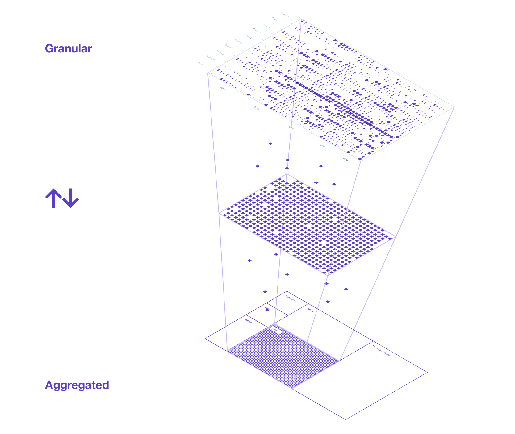
The complex goal of creating a universal resource to ease the work of IBM designers when dealing daily with data-dense scenarios was achieved by combining very specific and pragmatic directions with high-level guidance for designing successfully with data. Accurat and the IBM Design team explored and codified basic directions on colors, shapes, and types of data visualizations and addressed common statistical and visual representation mistakes. More high-level guidelines on composition, visual storytelling, optimal data density in different contexts, and the use of animation and interaction as an additional aide to drive comprehension and engagement were also provided. These different elements were combined to create a functional and modular Data Visualization Design Language, a shared vocabulary for producing superior data visualization design at IBM.
Process
In the early phases of the process, Accurat set out to collaborate with different product teams at IBM Design and to explore and prototype solutions for real-life scenarios in different industries, such as business analytics, IT security, drug discovery, and medical research: these very specific and low-level case studies helped the team form a better understanding of the wide array of environments where IBM designers operate, and led to the design of high-level principles that could be easily translated into a practical guide and applied at scale across the many industries for which IBM designs.

As shown in these initial artworks, we've taken IBM materials and shapes from the past to create analogies for new data visualization concepts.


In this sketch, the textures of numbered rows and columns on IBM’s punchcards look like single elements that can be interacted with on a data visualization.
Accurat designed a collection of unique signature charts inspired by the brand’s visual heritage.